how to analyze financial statements: A practical guide for sharper insights
Learn how to analyze financial statements with practical examples and actionable tips to interpret balance sheets, income statements, and cash flow.

Before you can really dig into a company's financials, you have to get a feel for the three core documents that tell its story. Think of them as three different camera angles on the same subject. The income statement tells you if the company is profitable over a certain period. The balance sheet gives you a snapshot of its financial health on a specific day. And the cash flow statement shows you where the actual cash is coming from and going.
When you learn how to read them together, you get the complete picture.
Decoding the Three Core Financial Statements
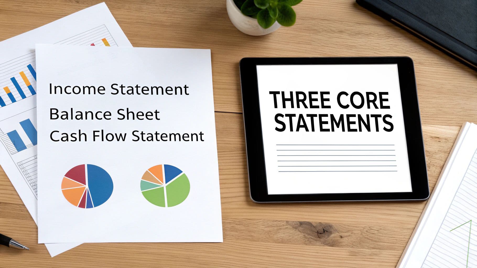
Jumping into financial analysis without understanding these documents is like trying to read a book by starting in the middle. You need to speak the language first. These three statements are the foundation, and they’re all interconnected, weaving a single narrative about a company's performance, stability, and potential.
To get a high-level view, here's a quick breakdown of what each statement offers.
Overview of the Core Financial Statements
| Statement | What It Shows | Key Question It Answers |
|---|---|---|
| Income Statement | A company's revenues, expenses, and profits over a period (e.g., a quarter or year). | "Is the company profitable?" |
| Balance Sheet | A snapshot of a company's assets, liabilities, and equity at a single point in time. | "What does the company own and owe?" |
| Cash Flow Statement | The movement of cash from operating, investing, and financing activities over a period. | "Where is the company's cash coming from and going?" |
Each one gives you a different piece of the puzzle. Now, let's look at them a bit more closely.
The Profitability Story: The Income Statement
The income statement, often called the Profit and Loss (P&L), gets straight to the point: Is this business making money? It lays out all the revenues and subtracts the costs and expenses incurred to generate that revenue over a specific period, like a quarter or a fiscal year. For a really detailed look, a dedicated Profit and Loss Analyzer can help you break down the numbers even further.
It's all about operational performance. The key line items you'll always see are:
- Revenue (or Sales): The "top line." This is the total money brought in from sales.
- Cost of Goods Sold (COGS): The direct costs tied to producing what the company sells.
- Gross Profit: What's left after you subtract COGS from revenue. It’s a great first look at profitability.
- Net Income: The famous "bottom line." This is the profit left after every single expense, including interest and taxes, has been paid.
The Financial Snapshot: The Balance Sheet
While the income statement tells a story over time, the balance sheet is like a photograph—it captures a company's financial position on one specific day. It shows what a company owns (its assets) and what it owes (its liabilities).
It all comes down to one core formula: Assets = Liabilities + Shareholders' Equity. This equation must always be in balance. If it isn't, something is seriously wrong with the accounting. This statement gives you a solid look at the company's financial structure and whether it can cover its debts.
When you examine these statements, you're essentially using the past to understand the present and predict the future. A business showing consistent revenue growth of 10-15% annually over five years, for instance, signals strong performance and a healthy trajectory.
The Cash Reality: The Cash Flow Statement
I've seen many people argue that this is the most important statement of the three, and for good reason. It tracks the actual, physical cash moving in and out of a company. Profit is an accounting concept, but cash is king—it's what you use to pay bills, reinvest in the business, and pay back investors.
A company can look profitable on its income statement but be bleeding cash, which is a massive red flag. The cash flow statement cuts through the accounting estimates and shows the hard truth.
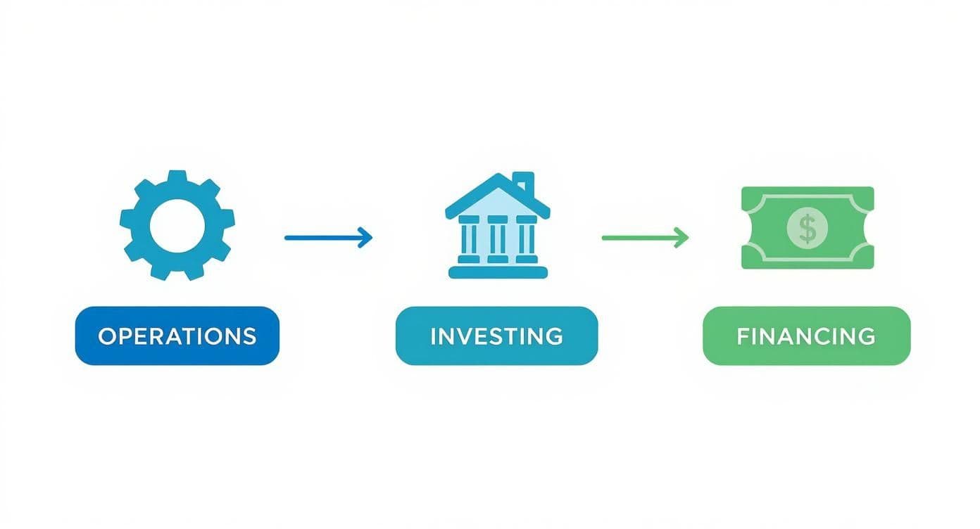
It's always broken down into three key areas:
- Operating Activities: Cash from the primary, day-to-day business operations.
- Investing Activities: Cash spent on or made from investments, like buying equipment or selling property.
- Financing Activities: Cash from activities like taking out loans, issuing stock, or paying dividends.
Seeing how these three statements link together is the first real step. Once you get that, you're well on your way to analyzing a company like a pro.
How to Spot Trends with Comparative Analysis

Looking at a single financial statement is like seeing one frame of a movie—it gives you a snapshot, but you miss the plot. To really understand where a company has been and where it's headed, you need to compare its numbers over time and against a benchmark. This is where comparative analysis comes in, turning static data into a dynamic story.
Two of the most fundamental techniques in any analyst's toolkit are horizontal and vertical analysis. They might sound a bit academic, but the concepts are simple, powerful, and absolutely essential. Think of them as two different lenses you can use to examine the same set of financials.
Horizontal Analysis: The Year-Over-Year Story
Horizontal analysis, often called trend analysis, is all about looking at performance over time. You're simply comparing a specific line item—like revenue, cost of goods sold, or net income—across multiple periods. This could be year-over-year, quarter-over-quarter, or even over a five-year span.
This is how you spot momentum. For instance, seeing revenue jump by 15% from one year to the next is a clear sign of growth. But it also helps you uncover potential problems. What if revenue grew by 10%, but accounts receivable ballooned by 30%? That’s a red flag. It could mean the company is having trouble collecting cash from its customers, a critical insight you’d miss by only looking at a single year's report.
For a deeper dive into how this works in practice, you can explore more about financial statement trend analysis and its applications. For example, a company's revenue increasing from $2 billion to $2.4 billion in one year represents 20% growth, a powerful indicator of strong sales performance. Seasoned analysts know that spotting these trends can reveal whether a company's financial health is improving long before it's reflected in the stock price.
Vertical Analysis: The Proportional View
If horizontal analysis is the movie, vertical analysis is a detailed blueprint of a single frame. This technique forces you to look at the relationships within a single financial statement by expressing each line item as a percentage of a base figure.
- On the Income Statement: Every item is calculated as a percentage of total revenue.
- On the Balance Sheet: Each item is shown as a percentage of total assets.
This method, also known as common-size analysis, is fantastic because it standardizes the financials. It allows you to easily compare a massive company like Walmart to a smaller regional retailer, or to see how your own company's cost structure has shifted over time.
Vertical analysis gets to the heart of a company's financial structure. It answers questions like: For every dollar of sales, how many cents are left after paying for the goods? How much of the company is funded by debt versus shareholder equity?
A Real-World Example: Uncovering Squeezed Profitability
Let's put this into practice. Imagine you're looking at a company called "RetailCorp." The headline news is great: revenue is up 10% this year! Management is celebrating, but a good analyst knows the real story is often buried deeper.
You decide to run a quick vertical analysis on the income statement, and you find something troubling:
| Income Statement Item | Last Year | This Year |
|---|---|---|
| Revenue | 100% | 100% |
| Cost of Goods Sold (COGS) | 60% | 65% |
| Gross Profit Margin | 40% | 35% |
Even though total sales dollars increased, the Cost of Goods Sold (COGS) is now eating up 65 cents of every revenue dollar, a significant jump from 60 cents last year. Consequently, the company's gross profit margin has shrunk from 40% to just 35%.
Suddenly, the story has completely changed. That impressive 10% revenue growth might have been driven by heavy price cuts or a shift toward lower-margin products—strategies that often can't be sustained. This is the kind of critical insight that separates a quick glance from a true professional analysis, helping you spot risks that others might have missed entirely.
Using Financial Ratios for Deeper Insights
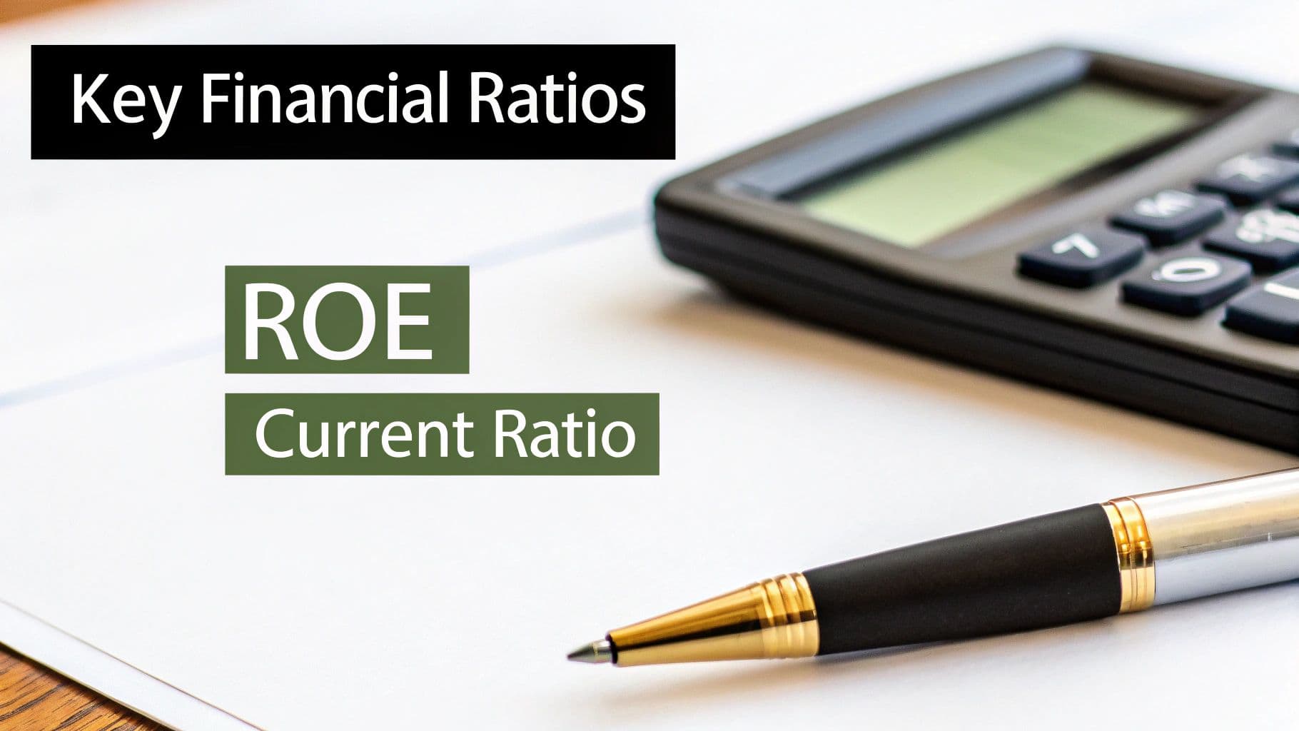
Looking at trends in financial statements tells you where a company is heading. Financial ratios, on the other hand, tell you the why and the how well. They're the tools that let you measure the quality and magnitude of a company's performance.
Ratios turn a sea of raw numbers into standardized metrics. This is what allows you to compare a corporate giant to a scrappy startup, or to see how a company stacks up against its industry peers. Without ratios, you're just looking at numbers in a vacuum. With them, you can start asking the right questions about a company's health, efficiency, and profitability.
Are the Bills getting Paid? Checking Liquidity
First up, liquidity. These ratios answer a simple but critical question: can the company cover its short-term bills? Think of it as a financial stress test. If all debts due in the next year were called in tomorrow, could the company pay up without selling off the furniture?
The most common check-up is the Current Ratio, which is simply current assets divided by current liabilities. It’s your go-to for a quick snapshot of a company's ability to handle its immediate debts.
For a tougher test, I always look at the Quick Ratio (also called the Acid-Test Ratio). It’s a more conservative measure because it strips inventory out of the "current assets" part of the equation. Why? Because you can't always sell inventory at a moment's notice, and its value isn't guaranteed. It's a much better gauge of true, immediate liquidity.
From my experience, a good benchmark for a healthy current ratio is anywhere from 1.5 to 2.0. If I see a company consistently dipping below 1.0, it's an immediate red flag for potential cash flow problems.
How Good is the Business at Making Money? Gauging Profitability
Profitability ratios are the ultimate report card on a company's performance. They cut through the noise and tell you how effectively management is turning sales into actual, spendable profit.
A few of my favorites are:
- Gross Profit Margin: This shows you what's left from revenue after paying for the cost of the goods sold (COGS). A healthy, high margin tells me the company has real pricing power or a super-efficient production process.
- Net Profit Margin: This is the famous "bottom line." It shows you how much of each dollar in sales is left after every single expense—including interest and taxes—has been paid. It’s the purest measure of overall profitability.
- Return on Equity (ROE): This one is powerful. It measures how much profit the company wrings out of every dollar invested by its shareholders. It’s a fantastic indicator of how well a company uses its investors' money to generate returns.
But context is everything here. A sky-high ROE might look great, but if it's being juiced by a mountain of debt (which shrinks the "equity" part of the formula), it's actually a sign of massive risk. You have to look at the whole picture. Part of that picture is understanding the company's cost structure, which is where things like break-even analysis examples become incredibly useful.
Is the Company Built on a Solid Foundation? Assessing Leverage
While liquidity looks at the short-term, leverage ratios tell you about long-term stability. They dig into how the company is financed—is it running on its own money (equity) or on borrowed money (debt)? This gives you a clear window into its financial risk profile.
The classic leverage metric is the Debt-to-Equity Ratio. It does exactly what it says: compares total liabilities to shareholders' equity. A high ratio means the company is leaning heavily on debt, which can be great in good times but incredibly risky when the economy turns sour.
Another one I check is the Debt-to-Asset Ratio. This measures what proportion of the company's assets are paid for with debt. If this ratio climbs above 1.0, it means the company owes more than it owns. That's a precarious spot to be in.
Let me be clear: leverage isn't inherently bad. Ambitious companies use it to fuel growth. But high leverage is a double-edged sword that can amplify returns on the way up and bankrupt a company on the way down.
To make things easier, here's a quick cheat sheet with some of the most essential ratios I use.
Essential Financial Ratios Cheat Sheet
| Ratio Category | Ratio Name | Formula | What It Measures |
|---|---|---|---|
| Liquidity | Current Ratio | Current Assets / Current Liabilities | Ability to meet short-term obligations |
| Liquidity | Quick Ratio | (Current Assets - Inventory) / Current Liabilities | Ability to meet short-term obligations without selling inventory |
| Profitability | Gross Profit Margin | (Revenue - COGS) / Revenue | Profitability of core business operations before overhead |
| Profitability | Net Profit Margin | Net Income / Revenue | Overall profitability after all expenses, interest, and taxes |
| Profitability | Return on Equity (ROE) | Net Income / Shareholders' Equity | How efficiently the company uses shareholder money to generate profit |
| Leverage | Debt-to-Equity | Total Liabilities / Shareholders' Equity | The proportion of debt vs. equity financing the company |
| Leverage | Debt-to-Asset | Total Liabilities / Total Assets | The percentage of company assets financed through debt |
This table is a great starting point, but remember that the real magic happens when you use these ratios together to tell a story.
Putting It All Together: A Real-World Scenario
Let's walk through a quick example. Imagine you're comparing two companies in the same industry: "Stable Co" and "Growth Co."
| Ratio | Stable Co | Growth Co | Analysis |
|---|---|---|---|
| Current Ratio | 2.5 | 0.9 | Stable Co has a solid cash cushion. Growth Co might have trouble paying its bills. |
| Debt-to-Equity | 0.4 | 2.5 | Stable Co is funded conservatively. Growth Co is taking on a lot of risk. |
| Net Profit Margin | 15% | 5% | Stable Co has strong pricing and cost control. Growth Co's margins are razor-thin. |
| Return on Equity | 18% | 30% | Growth Co's high ROE is a red herring—it's fueled by risky debt, not efficiency. |
If you just looked at the 30% ROE for Growth Co, you might think it's the winner. But digging into the other ratios tells a completely different story. That impressive return is built on a shaky foundation of high debt and weak profitability. Stable Co, while not as flashy, has a much healthier and more sustainable financial profile.
This is the power of ratio analysis. It helps you look past the headline numbers and uncover the real story.
The Cash Flow Statement: Where the Truth Hides
You’ve heard it a thousand times: “cash is king.” When you’re tearing apart a set of financial statements, that old saying holds up. While an income statement can be massaged with accounting rules, the actual cash flowing in and out of a business is the cold, hard truth. It’s why so many seasoned analysts, myself included, see the cash flow statement as the ultimate reality check.
A company can look profitable on paper but be teetering on the edge of a cash crisis. This is the exact kind of red flag the cash flow statement is designed to uncover. It strips away the complexities of accrual accounting and shows you exactly where the money came from and where it went.
Of course, before you can get to the good stuff, you need clean data. A big part of the initial grunt work often involves converting bank statements to Excel, getting all that raw transaction data into a format you can actually work with.
Once your data is ready, you'll see the statement is broken down into three main sections. Each one tells a crucial part of the company's story, and learning to read the patterns between them is where the real insight lies.
Cash from Operating Activities
This is the engine room. This section shows you the cash generated from a company’s core, day-to-day business. A healthy, established company must consistently generate positive cash flow here. This is the money that pays for everything else—new equipment, debt service, you name it.
Here’s one of the first and most powerful checks you can run: compare Net Income to Cash Flow from Operations (CFO). If a company is posting big profits but its CFO is negative, stop what you're doing and dig deeper. It could mean customers aren't paying their bills (rising accounts receivable) or inventory is piling up in a warehouse somewhere. Both are serious warning signs.
A consistent gap where net income is much higher than operating cash flow is a massive red flag. It suggests the company’s profits aren't real—at least not yet—because they aren't converting into actual cash. No business can survive that forever.
Cash from Investing Activities
Think of this section as a look into the company's future plans. It tracks cash spent on long-term assets like buildings and machinery, known as Capital Expenditures or CapEx. It also shows cash received from selling off assets.
For a company in growth mode, you fully expect this number to be negative. They’re buying things to expand. A stable, mature company might have a smaller negative figure or even a positive one if it's offloading old equipment. But watch out for a large, consistently positive cash flow from investing. It could be a sign of distress, indicating the company is selling off vital assets just to keep the lights on.
Cash from Financing Activities
This is where you see how the company interacts with its owners and lenders. It covers all the cash coming from or going to investors and banks.
You'll find a few key things here:
- Issuing or repurchasing stock: Raising cash from new shareholders or using cash to buy back shares.
- Issuing or repaying debt: Taking out new loans or paying down old ones.
- Paying dividends: Handing cash profits back to the owners.
A startup in its early stages will almost always have a big positive number here; it's raising capital to fuel its growth. On the other hand, a stable blue-chip company might show a negative figure as it pays down debt, buys back stock, and pays out steady dividends.
Tying It All Together: The Narrative in the Numbers
The real skill isn’t just analyzing each section on its own. It's about seeing how they work together to paint a complete picture of the company's strategy and life stage. A classic healthy, mature company might look like this: positive cash from operations, negative from investing (reinvesting in the business), and negative from financing (rewarding shareholders).
Now, picture a different story. A company shows negative operating cash flow but positive financing cash flow. This pattern screams trouble. It often means the business is borrowing money or selling more stock just to cover its daily operating losses. That's an unsustainable path. By learning to spot these narrative patterns, you move beyond just crunching numbers and start to truly understand a company’s financial health.
A Practical Walkthrough of a Company Analysis
Theory is great, but getting your hands dirty is where you really learn how to analyze financial statements. Let's walk through a simplified analysis of a fictional e-commerce company, "InnovateRetail," to see how the three statements work together to tell a story.
This is exactly how you'd approach it in the real world, whether you're making an investment decision or prepping for a finance interview. We'll start with the big picture, then drill down, connecting the dots between profitability, liquidity, and actual cash generation.
Kicking the Tires on the Income Statement
The income statement is always my first stop. We're looking at InnovateRetail's performance over the last three years, and at first glance, things look pretty good. Revenue has climbed from $50 million to $75 million—a solid 50% increase. But a good analyst never stops at the top line.
When you dig a little deeper, a worrying trend emerges in the gross profit margin. Three years ago, it was a healthy 45%. Last year, it slipped to 42%, and now it’s down to 38%. This tells me their Cost of Goods Sold (COGS) is growing faster than their revenue. Why? Could be anything from rising supplier costs and higher shipping fees to aggressive price-cutting just to win market share.
Further down, operating expenses are up, but thankfully at a slower pace than revenue. The final verdict? Net income has only inched up from $5 million to $5.5 million. That’s a mere 10% increase, despite that huge jump in sales. Suddenly, the story of explosive growth is tempered by a reality of shrinking profitability.
Calculating Key Ratios for a Health Check
Now, let's grab some numbers from the balance sheet to calculate a few key ratios. This is how we get a sense of the company’s stability and efficiency under the hood.
I’m going to focus on two critical areas: liquidity and leverage.
- Current Ratio: InnovateRetail's current ratio (Current Assets / Current Liabilities) has nosedived from a comfortable 2.2 two years ago to a concerning 1.1 today. That sharp drop is a major signal that its ability to cover short-term debts is getting dangerously tight.
- Debt-to-Equity Ratio: Looking at how the company is funded, the debt-to-equity ratio (Total Liabilities / Shareholders' Equity) has jumped from 0.5 to 1.5. This tells me they're leaning much more heavily on debt to pay for their expansion.
This combination is a classic red flag. The company is piling on debt while its short-term cash position is weakening. High leverage can amplify your returns on the way up, but it also magnifies risk, especially when liquidity is this thin.
Finding the Truth in the Cash Flow Statement
The income statement showed us shrinking margins, and the balance sheet revealed rising debt and weak liquidity. The cash flow statement is where we find out why. This is where the whole story comes together.
The cash flow statement is broken down into three core activities that determine where a company's cash is really coming from and going to.
Understanding the interplay between these three sections is crucial for diagnosing a company's true financial health. Looking at InnovateRetail’s statement, we see a disturbing pattern.
-
Cash from Operations (CFO): Over the past three years, CFO has been consistently negative, even while the company was reporting positive net income. This disconnect confirms my earlier suspicion—those paper profits aren't turning into actual cash. A ballooning accounts receivable balance is the most likely culprit.
-
Cash from Investing (CFI): The company shows a significant negative cash flow from investing. It's spending heavily on new warehouses and technology, which explains the growth but also highlights its constant need for cash.
-
Cash from Financing (CFF): And here’s the smoking gun. InnovateRetail has a large positive cash flow from financing. It has been taking on new loans left and right, not just to fund its expansion but to cover its operating cash shortfall.
The complete narrative is now crystal clear. InnovateRetail is a fast-growing company that is sacrificing profitability and taking on significant debt to fuel its top-line growth. It isn't generating enough cash from its core business to sustain itself, forcing it to borrow money just to stay afloat. It's a high-stakes gamble that can't last forever.
For those looking to build detailed projections from this kind of analysis, mastering financial modeling best practices is the essential next step. This walkthrough shows that a full analysis requires weaving together insights from all three statements to uncover the real story behind the numbers.
Common Questions in Financial Statement Analysis
As you start putting theory into practice, you'll find certain questions pop up again and again. Getting these sorted is key to building confidence and sharpening your analytical eye. Let's walk through some of the most common hurdles new analysts run into.
Which Financial Statement Is the Most Important?
If you ask ten seasoned analysts this question, you might get a few different answers, but many will point to the Cash Flow Statement as the most revealing. Why? Because profit is ultimately an opinion shaped by accounting rules and assumptions, but cash is a hard fact. Cash is what keeps the lights on, funds expansion, and pays back investors.
The cash flow statement gives you a brutally honest look at how a company is actually generating and spending its money. It's much harder to manipulate than an income statement. It tells you the unvarnished truth: are the company's core operations generating enough cash to survive, or is it constantly tapping into debt or equity just to stay afloat?
How Do I Know if a Ratio Is "Good" or "Bad"?
A financial ratio on its own is just a number; it doesn't mean anything without context. A "good" ratio for a fast-growing software company could spell disaster for a stable, capital-intensive utility company. Context is everything.
To get a real sense of what a ratio is telling you, you need to compare it against two crucial benchmarks:
- The Company's Own History: How does this quarter's ratio stack up against the last three to five years of performance? You're looking for trends. Is performance getting better, worse, or staying flat?
- Industry Peers: How does the company compare to its direct competitors and the industry average? This is where you see if they are a leader, a laggard, or just middle-of-the-pack.
For example, a high debt-to-equity ratio might look scary at first glance. But if you see that it's right in line with the industry norm and has been stable for years, it’s likely just a reflection of how that specific industry is typically financed.
What Are the Most Common Red Flags to Look For?
Experience teaches you to spot the subtle warning signs that hint at deeper problems. These are the patterns that should make you stop, take a closer look, and ask some tough questions.
Here are a few of the biggest red flags I always watch out for:
- Growing Profits, But No Cash: The income statement looks great, with revenue and net income climbing. But when you look at cash flow from operations, it's flat or declining. This is a classic sign that a company is booking sales but can't actually collect the cash from its customers.
- More Debt, But No Growth: You see debt levels rising quarter after quarter, but there's no corresponding jump in assets or earnings. This often means the company isn't borrowing to invest in growth—it's borrowing just to cover its operating expenses.
- Consistently Shrinking Margins: Gross and net profit margins are getting thinner over time. This signals that the company is either losing its pricing power or its costs are spiraling out of control.
Spotting these issues is a fundamental skill. It's the same kind of critical lens applied during venture capital due diligence, where catching a single red flag can be the difference between a great investment and a total loss.
Finance interview prep is demanding. At Soreno, we provide the tools you need to master financial analysis under pressure. Practice with our AI-powered mock interviewer, get instant, detailed feedback on your performance, and track your improvement over time. Start your free trial today and walk into your next interview with confidence. https://soreno.ai