How to interpret correlation matrix: quick expert guide
how to interpret correlation matrix: a practical guide to reading coefficients, p-values, and heatmaps for real data.

So, you've just generated your first correlation matrix. It’s a grid of numbers, and it can feel a little intimidating at first glance. Let's break down how to read it, because it’s one of the most powerful first steps in any data analysis.
At its heart, a correlation matrix is just a table that shows you how different variables in your data move together. Each little box in that grid holds a Pearson correlation coefficient, which is a single number that packs a lot of information.
Making Sense of Your First Correlation Matrix

Think of this section as your personal translator for that grid of numbers. A correlation matrix is a foundational tool, giving you a bird's-eye view of the relationships simmering in your dataset.
Every cell in the matrix gives you the correlation coefficient for a pair of variables. That single number is your key to understanding what’s really going on.
Understanding the Numbers
The coefficient tells you two critical things at once:
- Direction (Positive or Negative): Is the sign positive or negative? A positive number means that as one variable goes up, the other tends to go up too. A negative sign means the opposite—as one increases, the other tends to decrease.
- Strength (0 to 1): How far is the number from zero? The closer the absolute value is to 1, the stronger the linear relationship. A value near 0 means there's little to no linear connection between the two.
Let's imagine you're looking at customer data. You might find a coefficient of +0.8 between 'time spent on site' and 'total purchase amount.' That's a strong positive relationship. It tells you that, generally, the longer people browse, the more they buy.
On the other hand, a coefficient of -0.2 between 'customer support calls' and 'satisfaction score' suggests a weak negative link. More calls are slightly associated with lower satisfaction, but the relationship isn't very strong.
Key Takeaway: You'll always see a diagonal line of 1s running from the top-left to the bottom-right. That's just a variable being compared to itself—a perfect correlation. It’s a handy landmark to help you get your bearings.
A Practical Guide to Correlation Coefficient Values
To make this even clearer, I've put together a quick reference table. When you're staring at your matrix, you can use this to get a gut feeling for what the numbers actually mean in a practical sense.
| Coefficient Range | Strength of Relationship | Direction | What This Tells You in Practice |
|---|---|---|---|
| ± 0.70 to 1.00 | Strong | Positive or Negative | These variables are tightly linked. If you know one, you can make a pretty good guess about the other. A major signal in your data. |
| ± 0.40 to 0.69 | Moderate | Positive or Negative | There's a noticeable relationship here. It's not a perfect prediction, but it's definitely a connection worth investigating further. |
| ± 0.20 to 0.39 | Weak | Positive or Negative | A small, sometimes "interesting," but often insignificant link. The variables don't move together in a very predictable way. |
| 0.00 to ± 0.19 | Very Weak or None | Positive or Negative | Essentially no linear relationship. Changes in one variable tell you almost nothing about the other. |
This table is a great starting point, but always remember that context is king. What's considered "strong" in one field, like physics, might be different from what's strong in a "messier" field like social sciences.
Reading the Symmetrical Grid
One thing you'll notice right away is that the matrix is symmetrical. The correlation between 'Variable A' and 'Variable B' is exactly the same as the correlation between 'Variable B' and 'Variable A'.
Because of this redundancy, you only need to look at half of the table—either the upper triangle or the lower triangle. Most people just pick one and ignore the other to avoid reading the same information twice.
Getting comfortable with this is a lot like learning how to analyze financial statements. Once you know what the key numbers and ratios mean, you can quickly spot the patterns and stories hidden in the data.
Beyond the Numbers: Is Your Correlation Statistically Significant?
Spotting a strong correlation, like a +0.8, feels like a breakthrough. But hold on. A seasoned analyst always has a nagging question in the back of their mind: is this relationship actually real, or did I just get lucky with this particular sample? This is where we need to dig deeper than just the correlation coefficient.
This is the crucial concept of statistical significance. Think of it as a reality check for your findings. Just because two things move together in your dataset doesn't mean they're truly connected in the wider world. Random chance can create surprisingly strong, but ultimately meaningless, patterns, especially when you're working with a small amount of data.
The P-Value: Your Reality Check
So, how do we test this? We use the p-value. When you run a correlation analysis, most software will hand you a second matrix filled with these p-values right alongside your correlation coefficients. The p-value answers a very specific, and very important, question:
If there were actually no relationship between these two variables in the real world, what’s the probability of seeing a correlation this strong (or stronger) in my sample, just due to random luck?
The unwritten rule in most fields is that a p-value below 0.05 is the gold standard. A p < 0.05 means there's less than a 5% probability that the relationship you're seeing is a random fluke. When your p-value is that low, you can confidently say your correlation is statistically significant—it's likely a real effect, not just noise.
R-Squared: The "So What?" Metric
The correlation coefficient tells you about strength and direction, but R-squared (R²) tells you about explanatory power. It’s a simple calculation: just square your correlation coefficient (r).
What R-squared reveals is the proportion of the change in one variable that can be explained by the other. For example, a correlation of r = 0.7 sounds impressive. But when you calculate R-squared (0.7 * 0.7), you get 0.49. This means that the second variable only explains 49% of the variation in the first. The other 51% is still a mystery, driven by other factors you haven't measured.
Getting this right is critical. A 2015 Federal Reserve paper highlighted how misinterpreting R-squared was a major blind spot in financial risk models. A correlation of r=0.707 feels solid, but it literally means you're only explaining half the picture. To learn more about these kinds of nuances, this detailed statistical guide from Jim Frost is an excellent resource.
Why Sample Size Is King
The real art of interpretation comes from understanding how correlation strength, p-values, and sample size all work together.
Let’s look at two scenarios:
- Scenario A: With a tiny dataset of 15 customers, you find a massive correlation of r = 0.80. But the p-value is a disappointing 0.12.
- Scenario B: With a huge dataset of 5,000 customers, you find a very weak correlation of r = 0.15. But the p-value is a tiny 0.001.
So, which finding should you trust?
It's Scenario B, without a doubt. Even though the correlation itself is small, the massive sample size and incredibly low p-value give us confidence that this weak relationship is real and not a fluke. The huge correlation in Scenario A, on the other hand, is almost certainly a random anomaly. The high p-value confirms our suspicion—with only 15 data points, it's easy for randomness to create the illusion of a strong connection.
Telling the Story Visually with Heatmaps
Let's be honest: nobody enjoys squinting at a giant grid of numbers. It’s a surefire way to miss the forest for the trees. This is where a heatmap becomes an analyst's secret weapon. Our brains are hardwired to spot patterns visually, and a heatmap turns a daunting table of correlations into a clear, intuitive story.
The concept is simple but incredibly effective. A heatmap applies a color gradient to your matrix cells. Strong positive correlations might be a deep red, while strong negative correlations show up as a cool blue. Values hovering around zero, indicating no relationship, typically fade into a neutral white or gray.
This simple visual transformation is a game-changer. Your eyes are no longer hunting for specific numbers; instead, they're naturally drawn to the most intense blocks of color. You can spot the most important relationships in your data in seconds, not minutes.
Spotting Patterns at a Glance
With a heatmap, clusters of highly correlated variables practically jump off the page. A big, dark red square instantly tells you that a whole group of features moves in lockstep. You don't have to read a single number to get that initial insight.
This is also fantastic for flagging potential problems early on. A classic example is multicollinearity, where your predictor variables are so correlated with each other that they can wreck a regression model. A heatmap makes these trouble spots impossible to ignore, long before you get deep into modeling. Building a solid analysis on a clear visual foundation is just as critical as following disciplined financial modeling best practices to ensure your numbers are sound.
This graphic breaks down the key stats that give context to any single correlation value.
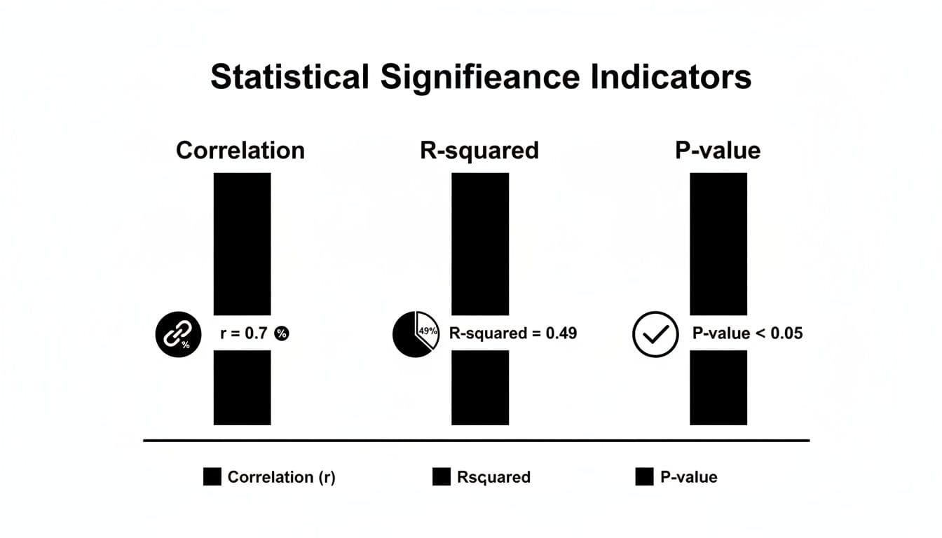
You can see how the correlation coefficient itself (r=0.7) is just the start. Its explanatory power (R-squared=0.49) and statistical significance (p-value <0.05) are what complete the picture, telling you if the relationship is both strong and trustworthy.
Pro Tips for Better Heatmaps
Over the years, I've learned that a few small tweaks can make a heatmap exponentially more useful. Here are a couple of my go-to techniques.
- Annotate with Values: Don’t just rely on the colors. Displaying the actual correlation coefficient inside each cell gives you the best of both worlds. The color provides the at-a-glance overview, while the number is there for a precise, detailed look when you need it.
- Reorder Your Matrix: This is a big one. Instead of leaving variables in their default order, use a clustering algorithm to group highly correlated variables together. This rearranges the matrix so that those strong red or blue blocks are neatly clustered, making the underlying structure of your data immediately apparent.
When you reorder and annotate, you’re not just making a chart; you’re crafting a narrative. The patterns become so clear that you can present your findings to anyone—technical or not—and they’ll instantly grasp the key relationships you've uncovered.
Putting Your Correlation Insights into Action
Figuring out what the numbers in a correlation matrix mean is one thing. The real magic happens when you use those insights to make smarter decisions. This is where your analysis stops being theoretical and starts having a real-world impact, especially when you're building models or planning strategy.
Once you get a feel for the relationships in your data, you can start tackling tangible business problems. Whether you're trying to build a better machine learning model or a more effective marketing campaign, the patterns you've uncovered are your roadmap.
Using Correlation for Smart Feature Selection
One of the most immediate pay-offs is in feature selection. When building a predictive model, the goal is to feed it variables that each offer unique, valuable information. Piling on more data isn't always the answer, especially if a lot of it is just redundant noise.
Your correlation matrix is the perfect tool for spotting that redundancy. Let's say you see that 'daily website visits' and 'daily ad clicks' have an extremely high positive correlation, something like +0.95. In practice, this means they're telling you pretty much the same story. Keeping both in your model can add complexity without actually making your predictions any better.
By pinpointing these highly correlated pairs, you can confidently decide to drop one. This simple step helps you build cleaner, more efficient, and often more accurate models.
Pro Tip: When you have to choose between two redundant variables, don't just flip a coin. Think about which one is more relevant to the business or has better data quality. I always lean toward keeping the feature that's easier for stakeholders to understand or more reliable to collect.
Diagnosing and Managing Multicollinearity
This leads directly to another critical task: diagnosing multicollinearity. This is a classic headache in statistical modeling—particularly in linear regression—where your predictor variables are highly correlated with each other.
When multicollinearity is running rampant, your model gets confused. It can’t figure out the individual impact of each variable, which leads to unstable and unreliable coefficient estimates. Essentially, you can't trust your model to tell you why it's making certain predictions.
A correlation matrix is your first line of defense. A quick scan for strong correlations between your independent variables (I usually start getting concerned around ±0.8) will flag potential multicollinearity issues before they can sabotage your analysis. The clarity you gain here is invaluable, much like how a solid go-to-market strategy framework brings order to a product launch.
A Foundation for Advanced Techniques
Think of the correlation matrix as more than just a standalone tool. It’s often the foundational first step for much more sophisticated analytical methods. Principal Component Analysis (PCA) is a perfect example.
PCA is a technique used to boil down a large number of correlated variables into a smaller, more manageable set of uncorrelated "components." And what's the primary input for PCA? You guessed it: a correlation or covariance matrix. The analysis literally uses the relationships you've already identified to construct new, more efficient variables from your original ones.
It's also important to remember that correlations aren't static; they can shift dramatically with external events. During the 2020 market crash, for instance, the average intra-sector correlation for Fortune 500 firms jumped from 0.45 to 0.92. In a crisis, everything starts moving together. Understanding these dynamics is key to building robust analyses.
Taking these concepts further into the real world, you can see how analyzing marketing data for data-driven decisions bridges the gap between raw numbers and strategic outcomes. This is where your analytical work truly starts to shine.
Avoiding Common Interpretation Traps

Knowing how to read the numbers in a correlation matrix is one thing. Knowing how to avoid the mental traps that lead to bad conclusions is another entirely. I've seen even experienced analysts stumble here, so let's walk through the most common pitfalls so you can steer clear of them.
First and foremost, the golden rule you’ve heard a million times but can never be repeated enough: correlation does not imply causation. Just because two variables move in sync doesn’t mean one is pushing the other around.
Think about the classic (and ridiculous) example: ice cream sales are often highly correlated with shark attacks. Does your afternoon soft-serve send sharks into a frenzy? Obviously not. There's a lurking variable—hot summer weather—that causes both. People eat more ice cream and swim in the ocean more when it's hot. Forgetting to look for these hidden drivers is probably the single biggest mistake you can make.
The Dangers of Assuming Linearity
Another trap I see all the time is assuming every relationship is a neat, straight line. The standard Pearson correlation coefficient, which is what most tools default to, only measures the strength of linear relationships. If your variables have a curved relationship, Pearson’s r could be close to zero, tricking you into thinking there’s no connection at all.
This is exactly why you can't just stare at the numbers in the grid. You have to see the data.
- Plot your data! For any correlation that seems particularly interesting or surprisingly weak, make a scatter plot. Your eyes will immediately spot a U-shaped curve or other non-linear pattern that a single number like
rwould completely miss. - Try Spearman's Rank Correlation: If you suspect the relationship isn't a straight line but still moves in one general direction (consistently increasing or decreasing), Spearman’s rank correlation is often a much better tool for the job.
A low correlation coefficient doesn’t always mean "no relationship." It often just means "no linear relationship." Your eyes are a better tool than any single statistic, so always visualize your data to see the full story.
The Influence of Outliers and Small Samples
A few wild data points, known as outliers, can completely throw off your results. A single extreme value can artificially inflate a weak correlation into a strong one, or it can do the opposite and hide a genuine relationship. You have to check for these anomalies before you start making definitive statements.
Drawing big conclusions from tiny datasets is just as dangerous. A strong correlation you find with just 20 data points is far less trustworthy than a moderate one you find in a sample of 2,000. Small samples are prone to random flukes and can produce spurious correlations that vanish when you look at more data. This is where checking your p-values and being honest about your sample size becomes critical for ensuring your findings are actually meaningful.
Digging Deeper: Common Correlation Questions
Once you get the hang of reading a correlation matrix, you'll inevitably run into some specific situations that need a bit more thought. These are the kinds of questions that come up when you're deep in the data, and getting them right is what separates a good analyst from a great one.
Let's walk through a few of the most common ones I hear.
What’s the Real Difference Between Covariance and Correlation?
I get this question a lot. The simplest way to think about it is that covariance just tells you if two variables move in the same direction. That’s it.
The problem is that covariance isn't standardized. A huge covariance value doesn't necessarily mean a strong relationship; it could just be that the variables themselves are on a huge scale (like sales in millions of dollars). This makes it almost impossible to compare the strength of different relationships.
Correlation is the hero here. It standardizes everything into a clean, universal scale from -1 to +1. This lets you make direct, apples-to-apples comparisons. In any practical data analysis job, you'll be working with correlation 99% of the time because it gives you both direction and strength.
When Should I Use Spearman Instead of Pearson?
Pearson is your go-to, your default. But it has two big weaknesses, and when you see them, you need to swap it out for Spearman.
You should switch to Spearman when:
- The relationship isn't a straight line. Take a look at your scatter plot. Do you see a clear curve? Maybe the relationship starts slow and then accelerates? Pearson will totally miss that. Because Spearman works with the ranks of your data, not the actual values, it can pick up on relationships that are consistently increasing or decreasing, even if they aren't linear.
- You have major outliers. Pearson is sensitive. A few wild data points can completely throw off its calculation and give you a misleading result. Spearman is much more robust against outliers because, again, it only cares about the rank order. That one crazy value might be an outlier, but its rank will still be just one number higher than the next point.
Spearman is also the right choice for ordinal data—think survey responses on a 1-to-5 scale where the distance between 1 and 2 isn't necessarily the same as between 4 and 5. A quick scatter plot is your best friend for making this call.
A crucial takeaway: The Pearson coefficient is only measuring the strength of a linear relationship. If the story your data is telling isn't a straight line, Pearson won't be able to read it. Always visualize your data first.
How Do I Explain a Correlation Matrix in a Job Interview?
This is a classic interview question. They aren't just checking if you can read the numbers; they're testing your ability to connect data to business impact.
My advice is to frame your answer in three quick parts.
First, lead with the headline. Find the most important relationships and state them clearly. "Right away, I see a very strong positive correlation of +0.85 between marketing spend and new user signups. With a p-value under 0.01, it's also highly significant."
Second, show you're a cautious, critical thinker. Add a layer of nuance that demonstrates your experience. "Of course, this doesn't prove causation, but it does highlight a powerful link. It also raises a red flag for multicollinearity if we were planning to use both variables in a regression model."
Finally, turn the insight into action. This is what managers want to hear. "Based on this, it seems our marketing efforts are a key driver of user acquisition. As a next step, I'd propose we dig deeper to see which specific marketing channels are giving us the best return on investment."
Ready to ace your next technical interview? Soreno provides an AI-powered practice platform to help you master case studies and behavioral questions. With instant, rubric-based feedback on everything from your communication style to your business insights, you can prepare with confidence. Start your free trial and practice with an AI interviewer trained by MBB experts today at https://soreno.ai.